
Romantic Vineyard Wedding Inspiration at Mira Vista Estate in Paso Robles
In the golden hills of Paso Robles, California, where vines stretch out beneath soft sunlight and the breeze whispers through the olive trees, the Mira Vista Estate rises as a modern-day château. It was here, among this breathtaking scenery, that a wedding editorial unfolded—one that blended luxury with softness, European charm with California warmth, and florals with flair.
I had the honor of designing the full stationery suite for this shoot, and to say it was a dream come true would be an understatement. Collaborating with the ever-talented Candice of Heyday Weddings, along with an incredible team of creatives, we brought a vision to life that I’m so excited to finally share with you.
If you're planning your own wedding and wondering how to translate your unique aesthetic into paper goods that wow, this editorial might just offer the inspiration you've been seeking. (And if you're not sure what your stationery style is, take my Wedding Invitation Style Quiz to get started!)
The Vision: Where European Luxury Meets California Vineyard


Candice, the planner and designer behind Heyday Weddings, dreamed up a shoot that felt both elevated and effortlessly romantic. Think: a weathered stone villa in Provence, but with the golden hues and rolling vineyards of Central California. This inspiration laid the groundwork for everything—the gowns, the floral arch, the ceremony altar, and especially, the stationery.
The design was refined, not fussy; luxurious, not ostentatious. The goal was to create an editorial that could appeal to both classic brides and modern romantics. Every detail felt intentional—from the blush and wine-toned blooms to the delicate vintage flatware on the reception tables. The Mira Vista Estate, with its expansive vineyard views, creamy stucco architecture, and European-style pergola, was the perfect canvas for this editorial’s story.
Designing the invitation Suite: A Love Letter in Paper Form
The invitation suite was created to embody timeless romance with a fresh, modern sensibility. I wanted the suite to feel like something you'd discover tucked into a vintage chest at a French château—elegant, delicate, and unforgettable.
Key Features of the Suite:

Custom Watercolor Illustration of Mira Vista Estate
One focal point of the stationery is a bespoke watercolor illustration of the estate itself, painted by the lovely Kristiana. I wanted guests to get a sense of the venue before they even arrived—to feel its charm, its architecture, its presence. This custom artwork acted as the anchor for the suite.Handmade Paper with Deckled Edges
Some pieces in the suite were printed on soft, deckled-edge handmade paper, while others were printed on a refined eggshell cardstock. This thoughtful mix of textures created visual depth and a tactile experience that felt both elevated and cohesive. The handmade elements brought an artisanal, heirloom quality, while the smooth cardstock provided structure and clarity—together, they told guests: this day matters.Muted Romantic Palette
Inspired by the florals and the natural tones of the estate, the suite featured a palette of soft blush, dusty rose, antique mauve, green, and warm ivory. I paired this with subtle touches of mauve ink to maintain a cohesive look with the rest of the day’s styling.Soft Silk Ribbon Wraps
Each invitation was tied with the softest silk ribbon in muted rose and blush tones. It’s a small detail, but one that adds movement and texture—and makes opening the invitation feel like unwrapping a gift.Coordinating Save the Dates, Vow Books & Menus
Continuity is everything. I carried the suite’s design through the save the dates, ceremony vow books, and reception menus. This created a visual narrative from the moment the guests received their mail all the way through the last dinner course.
You can see the full suite and more images here.
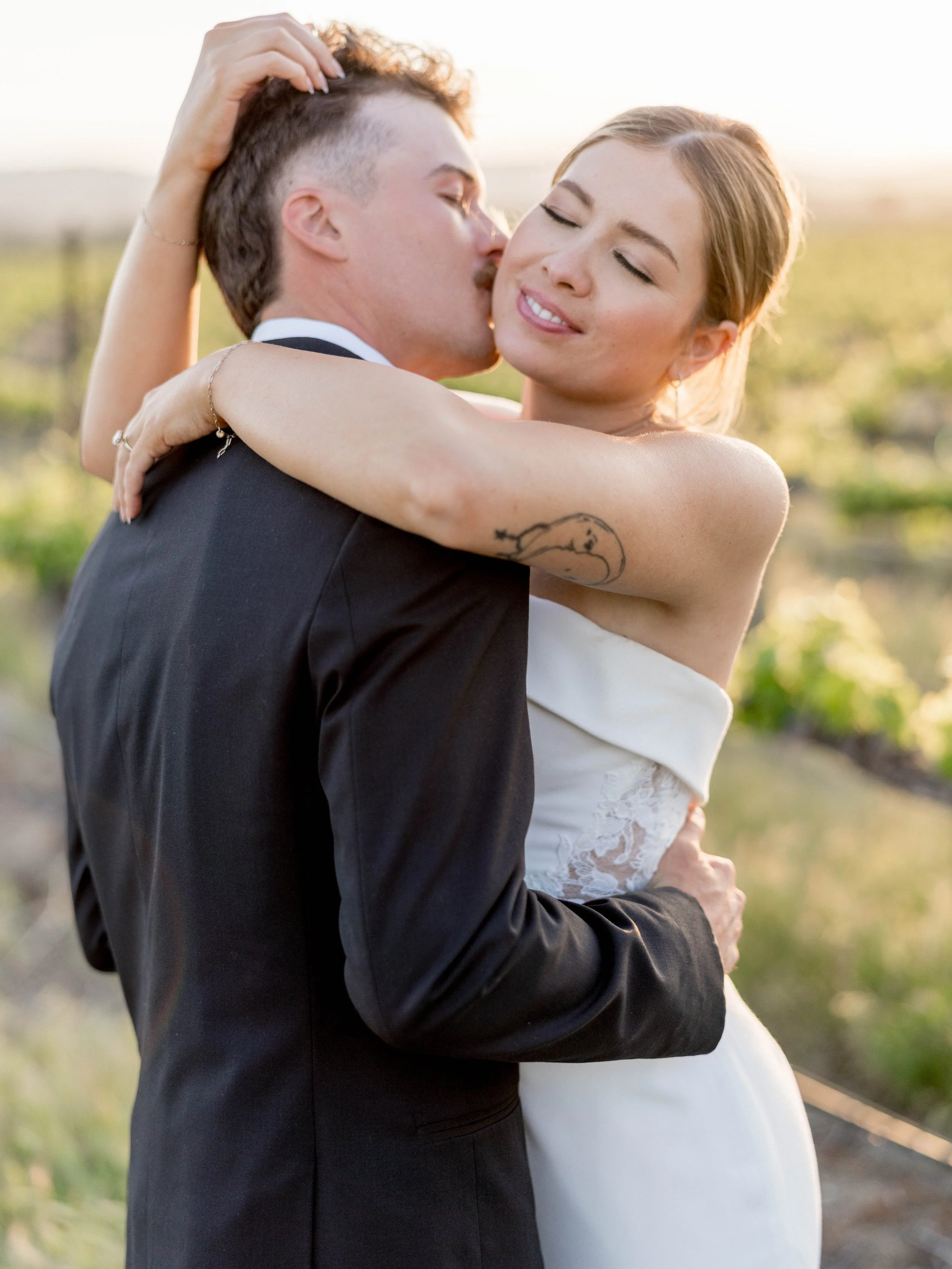
The Ceremony: Draped in Florals and Light
The ceremony took place beneath a grand pergola adorned with romantic, free-flowing fabric and lush florals in a palette of mauve, cream, blush, and soft greenery. With the vineyard rolling into the distance, and the couple framed in soft petals and golden sun, it was the kind of setting that feels straight out of a European fairy tale.
Behind the couple stood cascading greenery and roses carefully placed by the florist to look effortlessly abundant, like they’d always been there. The floral design perfectly echoed the palette of the stationery, tying the whole ceremony experience together visually.
As a stationer, these are the moments I live for—when the paper goods feel fully integrated into the couple’s world, not just an afterthought.
The Tablescape: Vintage Layers, Modern Sophistication


The reception table was a study in texture and elegance. Embroidered lace linens topped the tables, adding softness and dimension. Each place setting included layered vintage-style china plates, paired with crystal-clear glassware and brushed silver flatware.
And then, of course—the menus. Designed to sit gracefully on each plate, they featured the same script fonts and handmade paper as the invitation suite, accented with silk ribbon to echo the invitation wraps. Miranda, with Palette and Pine, created custom acrylic name tags for each guest, nestled on top of the menu for a subtle personalized touch.
The florals in the centerpiece were intentionally unstructured, featuring cafe au lait dahlias, garden roses, ranunculus, and lisianthus in that perfect palette of warm blush, peach, and raspberry. It was romantic, organic, and just a bit wild—exactly the look we were going for.
Stationery as a Sensory Experience
Wedding paper isn't just a visual element—it’s tactile. It’s emotional. It’s the very first impression your guests receive, and the thing they take home after the last dance. My goal with the stationery for this shoot was to create a stationery story that could be felt as much as seen.
From the frayed ribbon to the weight of the handmade paper, every element was meant to be touched, handled, and admired. And when those pieces were placed alongside the soft textures of the ceremony fabric and the lace table overlays, it all sang in perfect harmony.
Vendor Collaboration: Bringing the Vision to Life


This shoot truly pulled out all the stops. From a beautifully styled raw oyster bar to a charming vintage gelato cart, every element felt indulgent and intentional. As the sun set behind the vineyard, the couple wandered through golden rows of grapevines for romantic portraits that captured the essence of the day—elegance, joy, and just the right amount of whimsy. It was the kind of celebration that invites you to linger a little longer, to savor every texture, flavor, and view.
This shoot was made possible by an amazing team of vendors who each brought their own expertise and artistry to the table. I especially want to highlight Candice of Heyday Weddings, who not only planned and designed the shoot but curated a team who worked together seamlessly. Her creative vision shaped every element of the day—from the architecture-inspired altar setup to the soft table design.
The photographers (there were TWELVE!) captured the light and emotion of the day flawlessly. They gave every detail—from the vow books to the invitation flat lays—the time and styling they deserved, and it shows in every image.
It’s no exaggeration to say that without the thoughtful, collaborative energy of this team, the stationery wouldn’t have had the stage it needed to shine.
What This Editorial Means to Me

As a wedding stationer, I often pour my heart into designs that may only get a quick glance before being recycled. But shoots like this one remind me why I do what I do. Paper tells a story. It sets the tone. It invites someone into a moment.
This shoot gave me the space to explore that idea in full—to create a suite that was more than just an invitation. This suite became a symbol of timeless romance, of quiet luxury, of intentional design.
I hope couples can look at this editorial and see what’s possible when paper is treated not just as information, but as art.
Ready to Create Something Beautiful?
If you’ve fallen in love with the soft, romantic style of this shoot, or if you’re looking for wedding paper goods that reflect your story in an authentic and elevated way, I’d love to work with you. Whether you're dreaming of a vineyard celebration, a garden soirée, or a destination wedding in Europe, we can create a suite that perfectly sets the tone.
And if you’re not quite sure what your wedding style is yet—don’t worry. Take my Wedding Invitation Style Quiz to uncover your unique aesthetic and get matched with a stationery design that fits your vibe.
Because every wedding deserves paper that feels like poetry.
Vendors
Photography: Leana Myra Photography
HOST: The Editorial Series
PLANNING & DESIGN: Hey Day Weddings
VENUE: Mira Vista Estate
FLORALS: By Request
GOWNS: Mareh Couture
BRIDAL SHOES: Bella Belle Shoes
JEWELRY: B Anthony Jewelers
BEAUTY: Bellizzimo Beauty
TUX: Tie The Knot Bridals
SIGNAGE: Palette and Pine
INVITATION SUITE & MENUS: Announcements by Adrienne (that’s me!!)
WATERCOLOR ARTIST: Painted Love by Kristiana
DRAPING & LIGHTING: Draping by Kim
SPECIALTY LINEN: BBJ La Tavola
LOUNGE: Scout Rental Co
CANDLE STYLING: Wicks of Love
RENTALS: Bright Event Rentals
BAR RENTAL: All About Events
CAKE: Arroyo Grande Bakery
GELATO CART: SLO Mama Sweets
CHARCUTERIE: SLO Graze
RAW BAR: The Costal Oyster Bar
BAR SERVICE: Mixed Events 805
WINE: Epoch Wines
LOVE STORY JOURNAL GIFT: Annay and Co
HOSPITALITY CONSULTING: Greer Hospitality
xoxo
Adrienne